Transforming manual reporting to delightful dashboard analytics

From a budding start-up to being one of Australia's leading practice intelligence platforms

About

As the sole designer at Cubiko, I led the design efforts and vision to create new features and experiences catered to experts in the healthcare industry. Our users were primarily practice owners/managers, doctors, nurses, receptionists.

Problem

One of the biggest design challenges was that Cubiko's UI was not built with a long-term plan for navigation, organisation or visual hierarchy. With over 1000+ metrics and more being added, users are immediately overwhelmed when they first use the product and cannot distinguish what high-value features or data they could be using. My role was to navigate these problems and bring value to our customers.

Impact

Increased profitability through reduced churn (< 5%), reduced support hours per customer, increased first impression value with improved conversation rate of potential customers, and improved user engagement by addressing customer pain points and simplifying the UX/UI.
New landing page concept

UX Overhaul

Problem

With more and more metrics and data being released into the app there was a growing usability issue.
No visual hierarchy
There was no logic on how metrics are shown on the page. Newer metrics were added to the bottom of the page which meant there was a lack of discoverability.
Too much information
With over a thousand metrics and a hundred pages (plus sub-pages), users were overloaded with information.
Poor navigation
Navigation was split between the top navigation bar and the sidebar. Similar content was spread across multiple pages, meaning that there were several ways to get to the same piece of information.  

Impact

Reduce churn and increase sales.
Lead generation from word of mouth.
Product-led growth.

Solution

During the discovery and solutions design, there were three main blocks of work identified:

1. Core navigation and filter design;
2. Visual appearance of individual filters, metrics and charts;
3. Organisation and structure of content in Cubiko and the landing page.

This project focussed on the first tranche of work. The visual appearance of individual metrics and charts could be tackled at a later date and the organisation of content required a strong product vision and needed to be addressed independently to this project.
Old landing page
Old sidebar on the left, new sidebar on the right
Plan for improving the core navigation and filter layout

Landing page redesign

Problem

Following the release of the UX overhaul, we identified a need to deliver a redesigned landing page to increase discoverability of existing metrics and let users get value from the product at a glance. Often being referred to as 'just another software to log in to' we had a very short timeframe to hook users and encourage them to log in again.

Solution

When brainstorming with the team there were 3 key elements to the landing page that stood out:

1. Headline metrics/stats (often referred to as the 'top 6');
2. Cubiko pushing information to users (e.g. recommendations, news and announcements, quick links);
3. Navigational elements (simplified navigation) - separate project

To me, it was necessary that we keep the landing page as simple as possible and with less interactions. I focussed on maintaining a similar structure to the previous landing page to prevent users from being further overwhelmed and chose to design a minimalistic dashboard with limited interactivity.
Old landing page
New landing page concept

Design system - a single source of truth

Problem

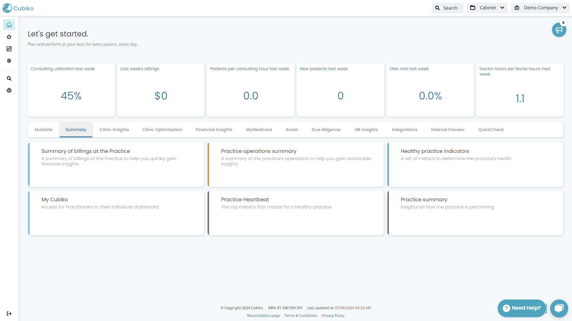
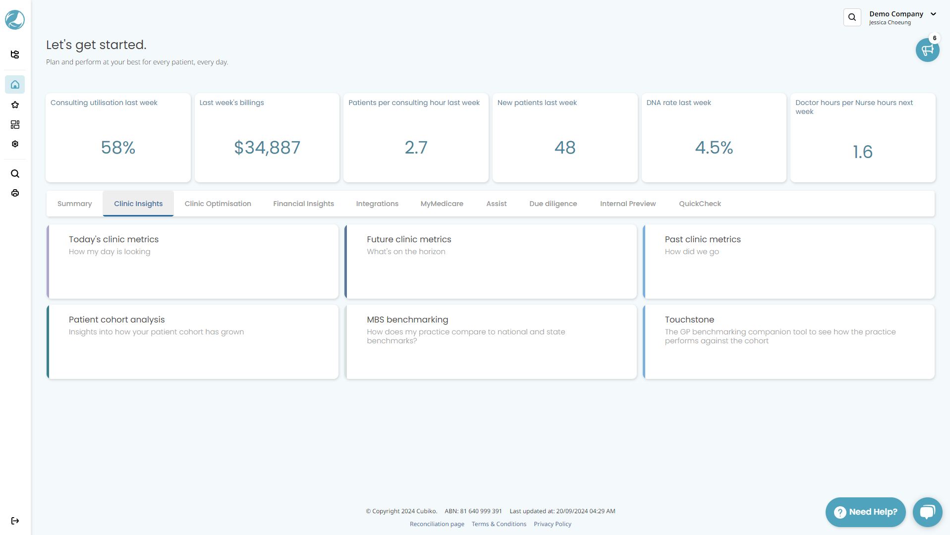
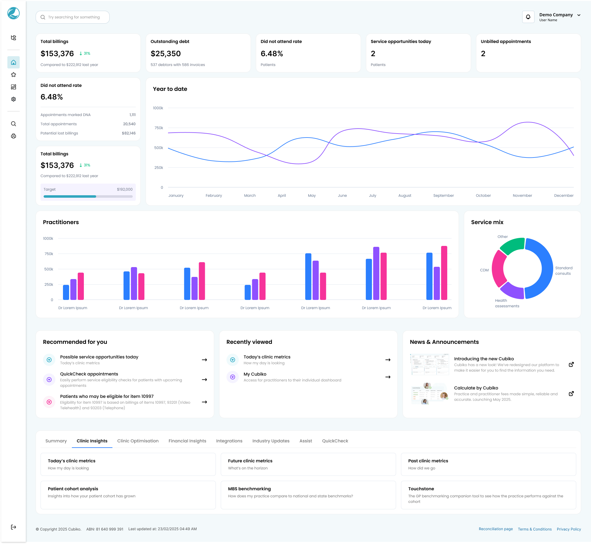
Designs never really turn out the exact same after development. When I first joined Cubiko, there was no clear design system in place. With different analysts and engineers all working from the same codebase, we needed a way to ensure consistency and to also let the devs handle small design decisions without needing help from a designer.

Solution

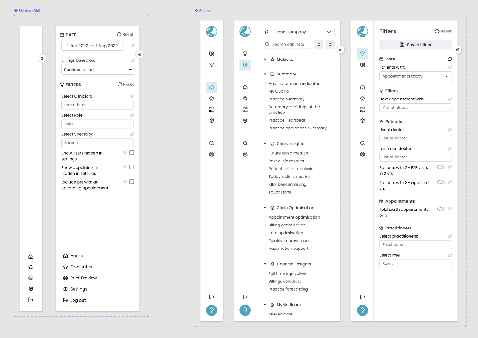
After going through a few options, we settled on implementing a design token system in the form of SCSS file. It was set up to integrate into our codebase but still required a bit of manual work and CSS knowledge to get it working nicely. This supported the reusable components library that I had already set up in Figma.

Other options we explored:
  • Using Figma as the source of truth and exporting to code;
  • Using a token-specific configuration file;
  • Using an external service to manage tokens.
All of the above had their own little annoyances and problems that made it more difficult to adopt and would affect the work process for devs.

How did it work?

Setting up the design tokens was a hurdle in itself. There was no consistency in terms of colours or spacing etc. I started by defining the primitive tokens, e.g. colours, shadows, font sizes, font weight, border radius and spacing. I also followed a 4pt grid system to ensure precision and consistency in implementation.

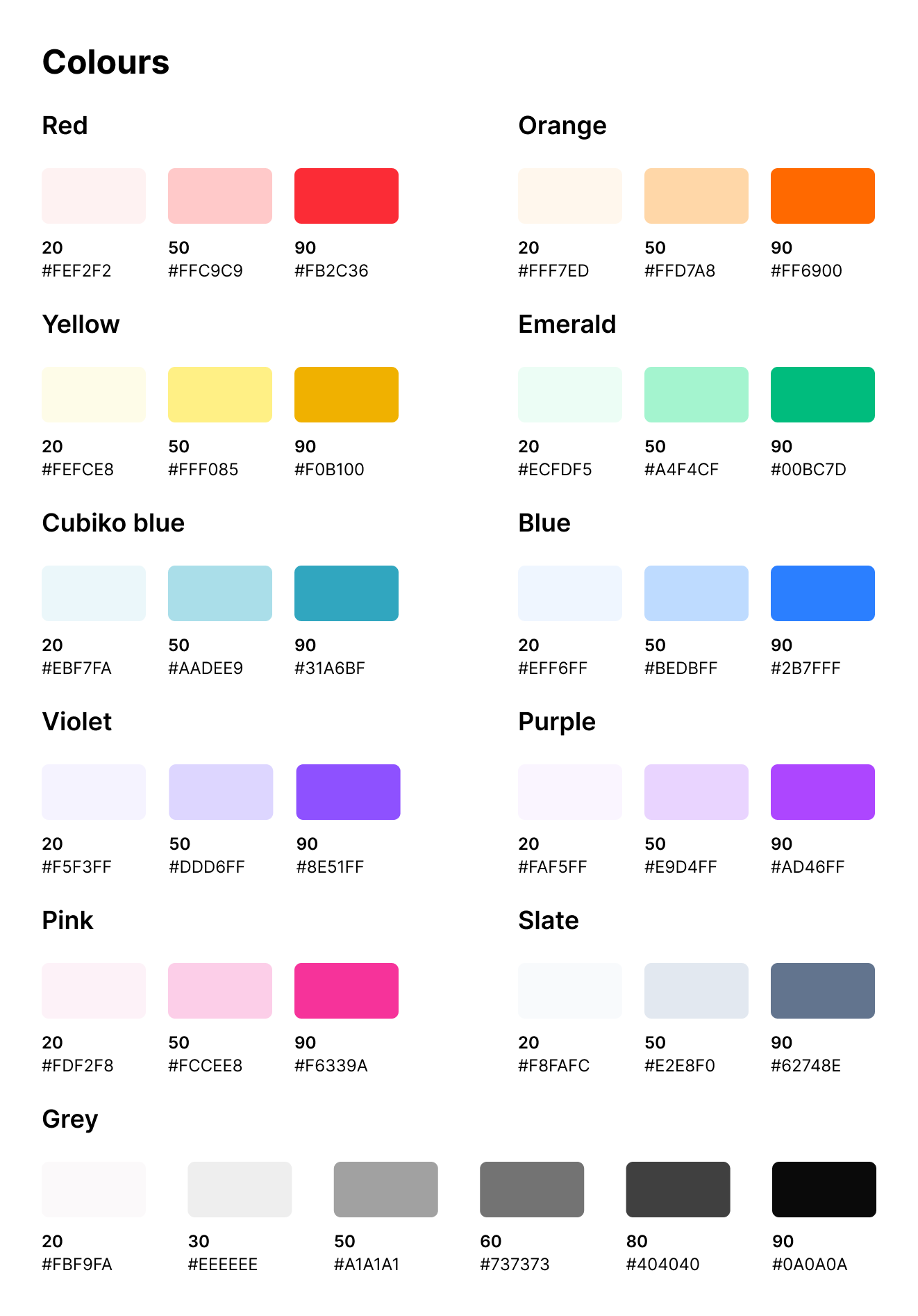
Colours were the most time-consuming as I took the opportunity to create a completely new set of colours that were more vibrant to fit the vibe and branding of Cubiko. I then picked a lighter shade and a medium to create a total of three variations. The rest of the tokens were configured to match what had already been implemented into the app and were also reflected in the component library in Figma.

Having a smaller, curated set of tokens meant that engineers and analysts could select from a pre-defined list which took the guess work out of small design decisions. This is also meant that designs were more likely to look harmonious and did not require extra design effort to check styling.
/** Example tokens.scss file **/


/* ****************
 * Primitive tokens
 * **************** */

:root {
  /* Colours */
  --red-20: #fef2f2;
  --red-50: #ffc9c9;
  --red-90: #fb2c36;
  ...
  
  /* Shadows */
  --shadow-20: 1px 2px 5px rgb(0 0 0 / 15%);
  --shadow-50: 2px 5px 15px rgb(0 0 0 / 13%);
  --shadow-70: 4px 7px 20px rgb(0 0 0 / 18%);
  
  /* Font sizes */
  --font-size-10: 0.625rem;
  --font-size-20: 0.75rem;
  --font-size-30: 0.875rem;
  --font-size-40: 1rem;
  ...
  
  /* Font weight */
  --font-weight-light: 300;
  --font-weight-regular: 400;
  --font-weight-medium: 500;
  ...
  
  /* Spacing */
  --spacing-base: 4px;

  --spacing-1: calc(1 * var(--spacing-base));
  --spacing-2: calc(2 * var(--spacing-base));
  --spacing-3: calc(3 * var(--spacing-base));
  --spacing-4: calc(4 * var(--spacing-base));
  ...
  
  /* Border radius */
  --border-radius-sm: 4px;
  --border-radius-md: 8px;
  --border-radius-lg: 16px;
  ...
}
Example tokens.scss file
Example colours

Reflections